Editorial and Graphic Design
Music Festival Rebrand
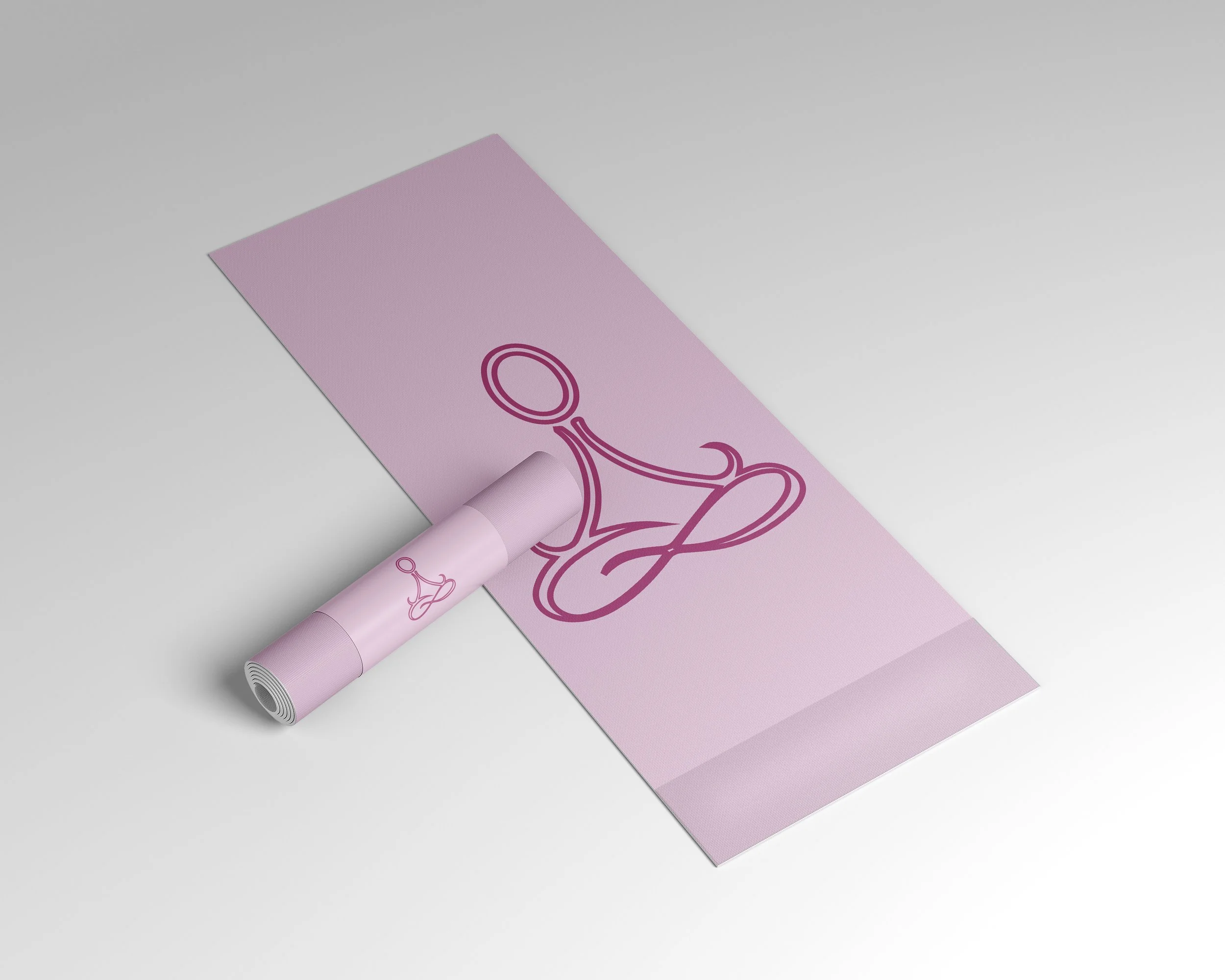
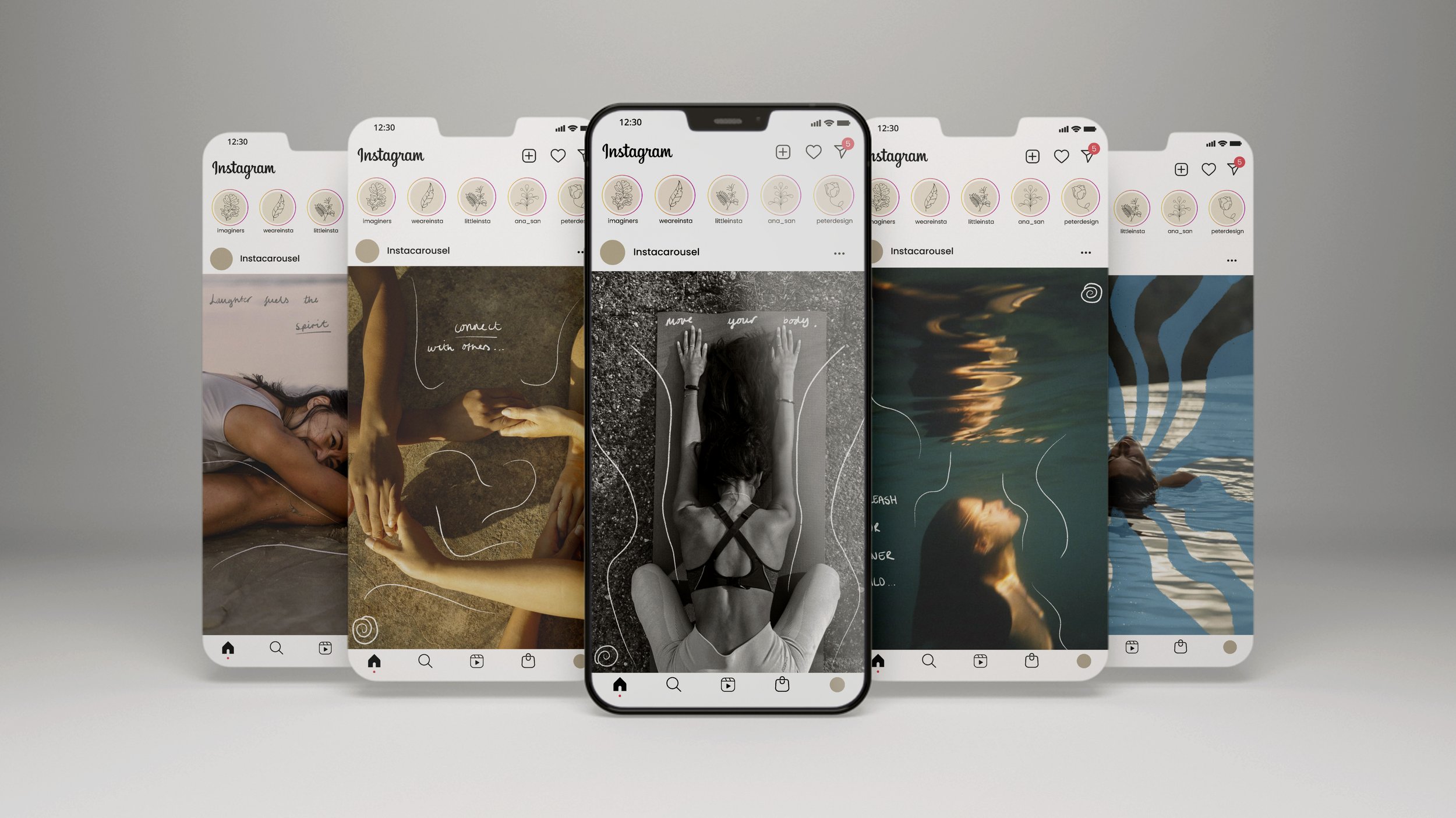
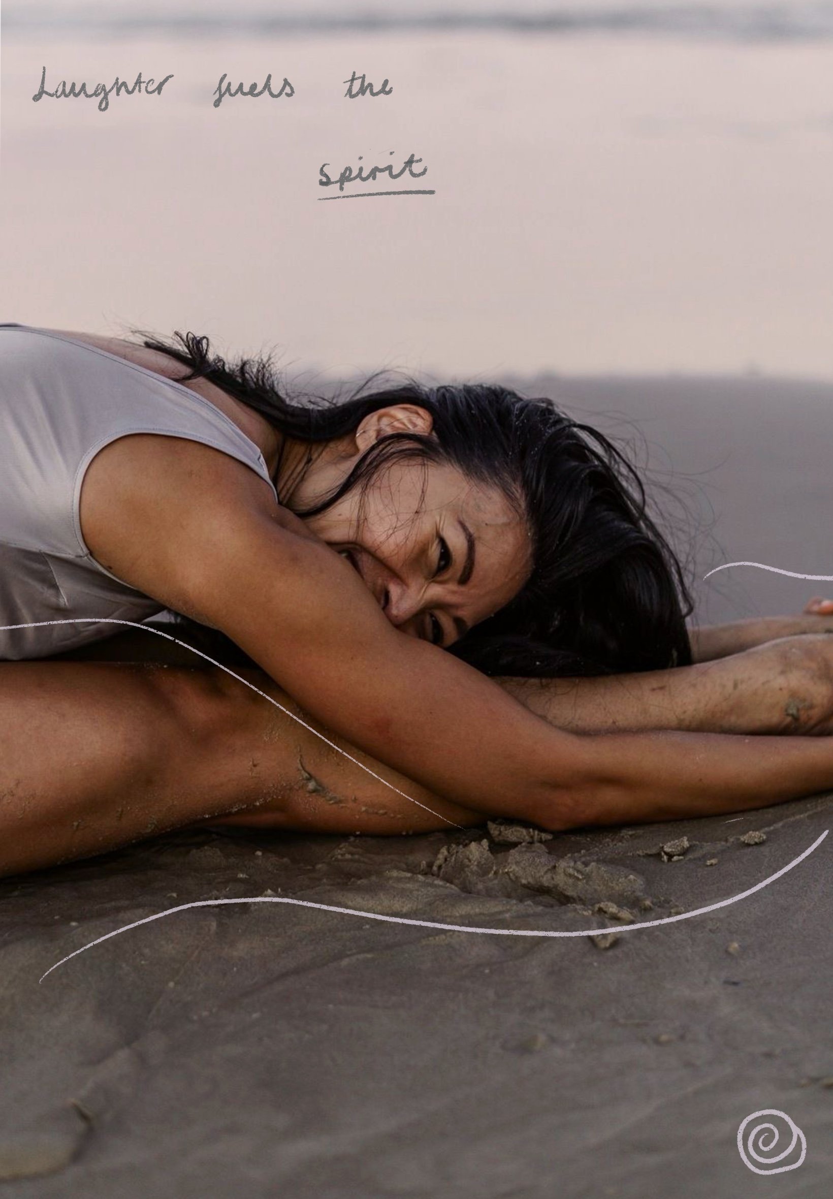

A brand identity project reimagining Awakened Soul as a festival for spiritual seekers and soulful explorers. The brief was to build a distinct identity that brings together mindfulness, music, and holistic healing without feeling commercial.
The work spanned audience definition, strategic positioning, visual identity, and logo design. The colour palette draws on soft pastels and cosmic gradients, earthy tones mixed with lavender, blush, and pale blue. Typography pairs an elegant high-contrast serif with a clean sans-serif body font, balancing spiritual texture with modern legibility. The logo merges a meditating figure with concentric sound-wave circles, combining the festival's two core elements into a single mark.
The result is an identity that carries a clear point of view across poster design, social content, and digital formats.
Editorial Design: Travel Journals
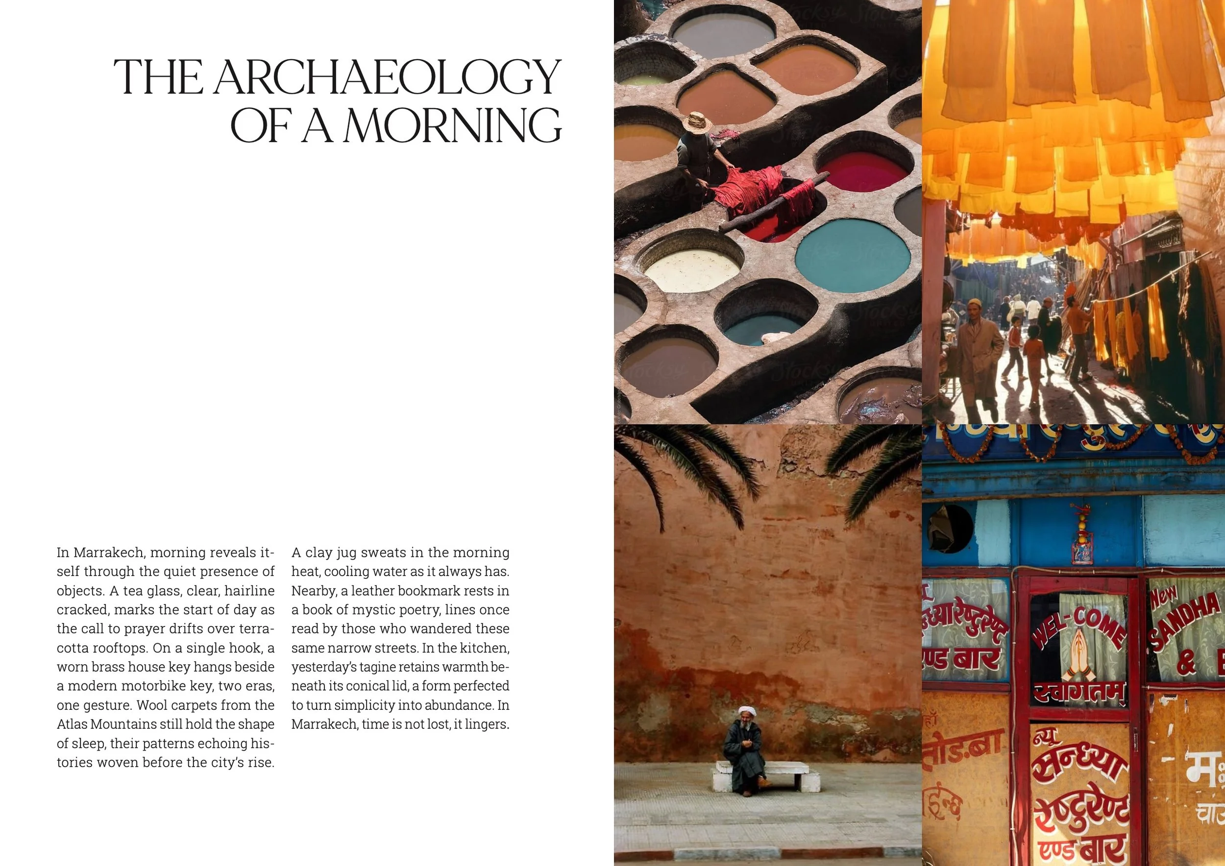
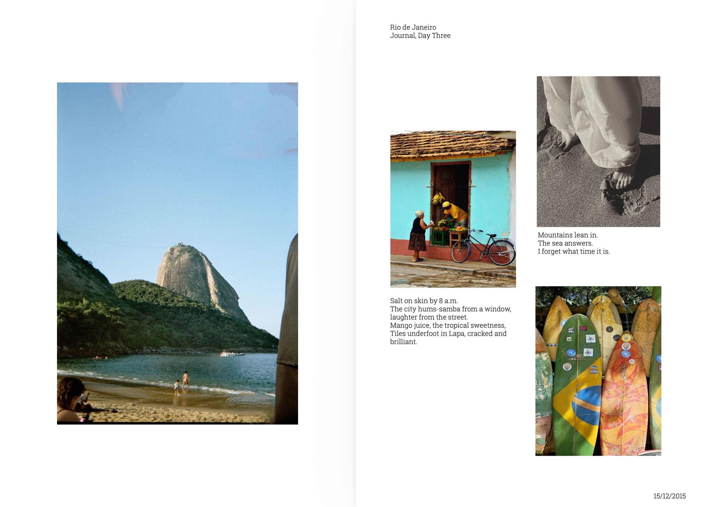
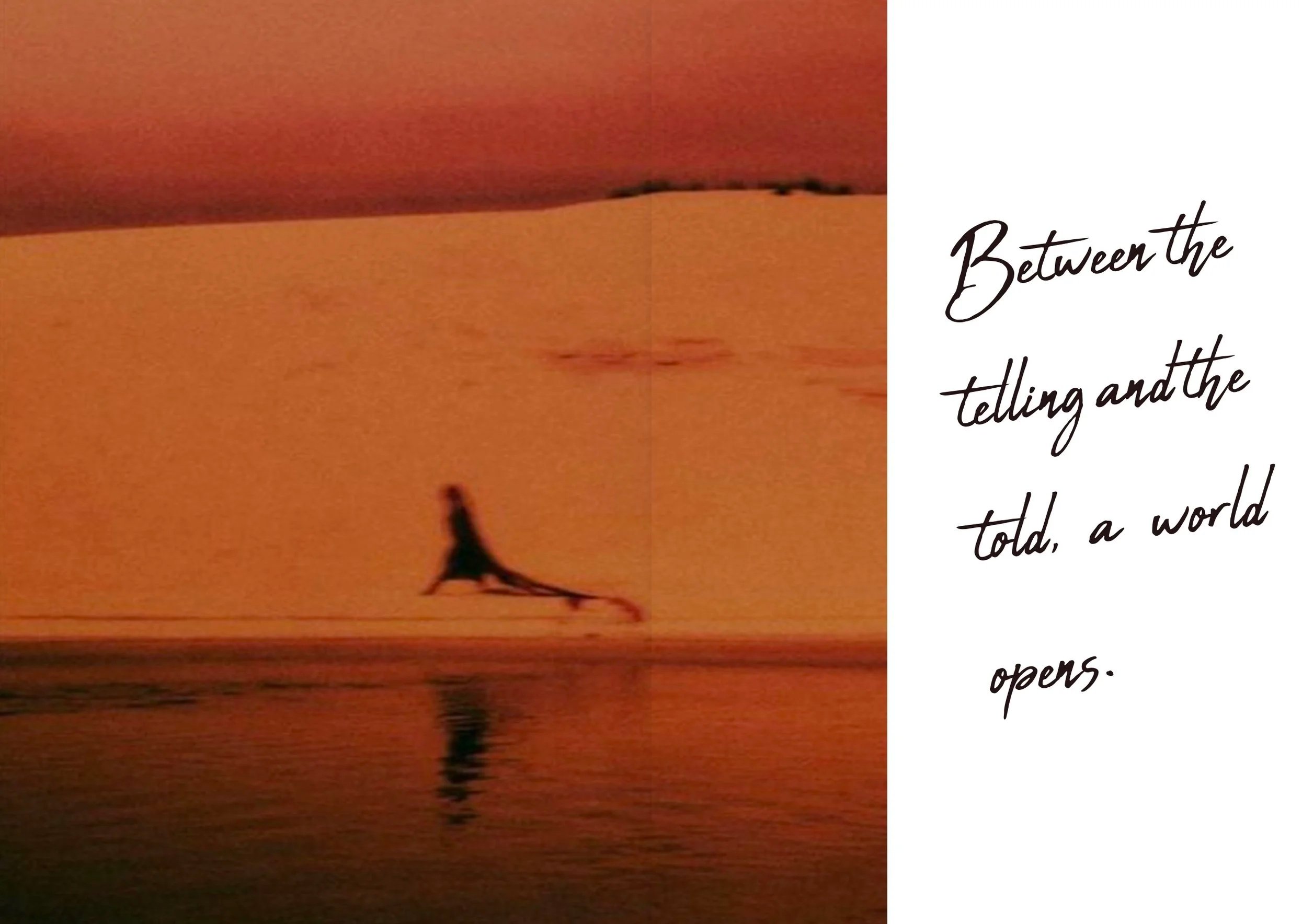
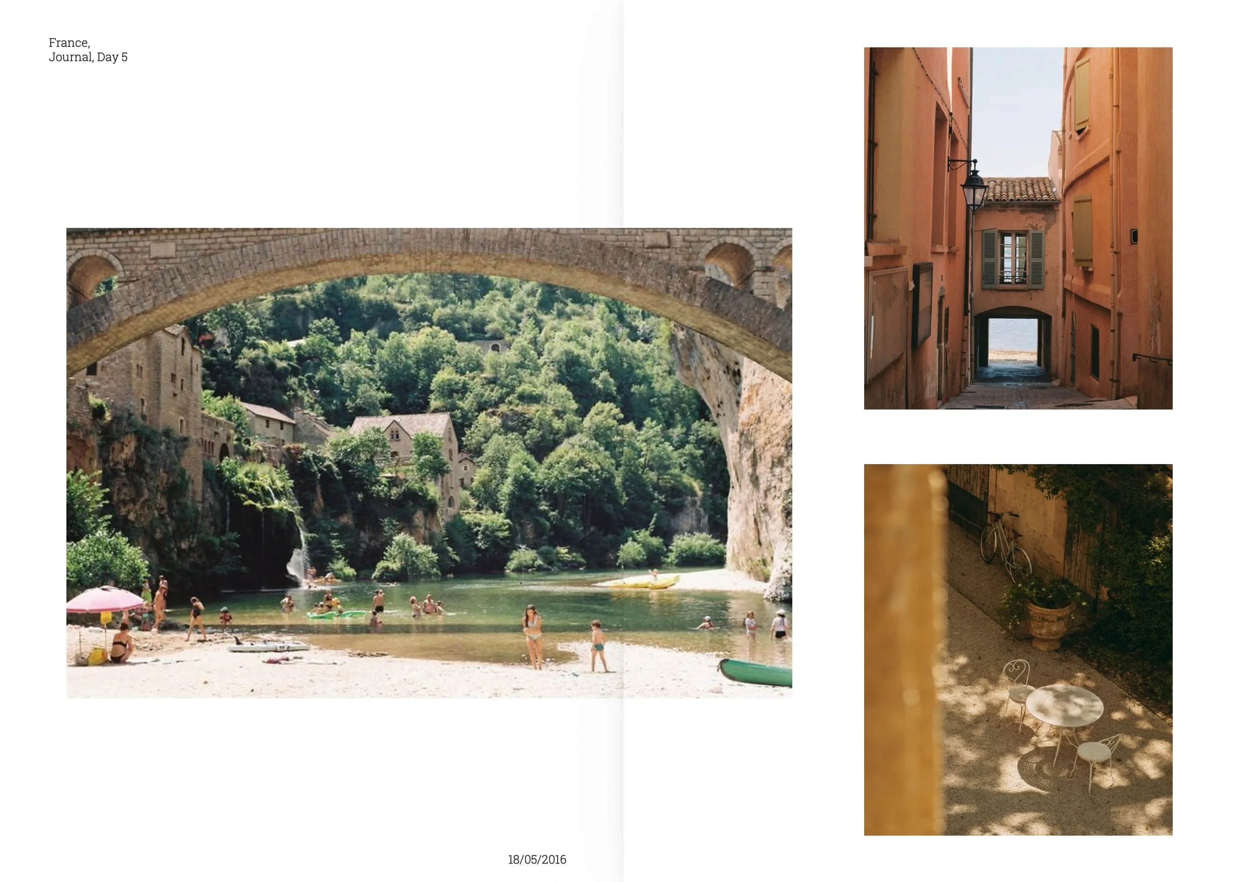
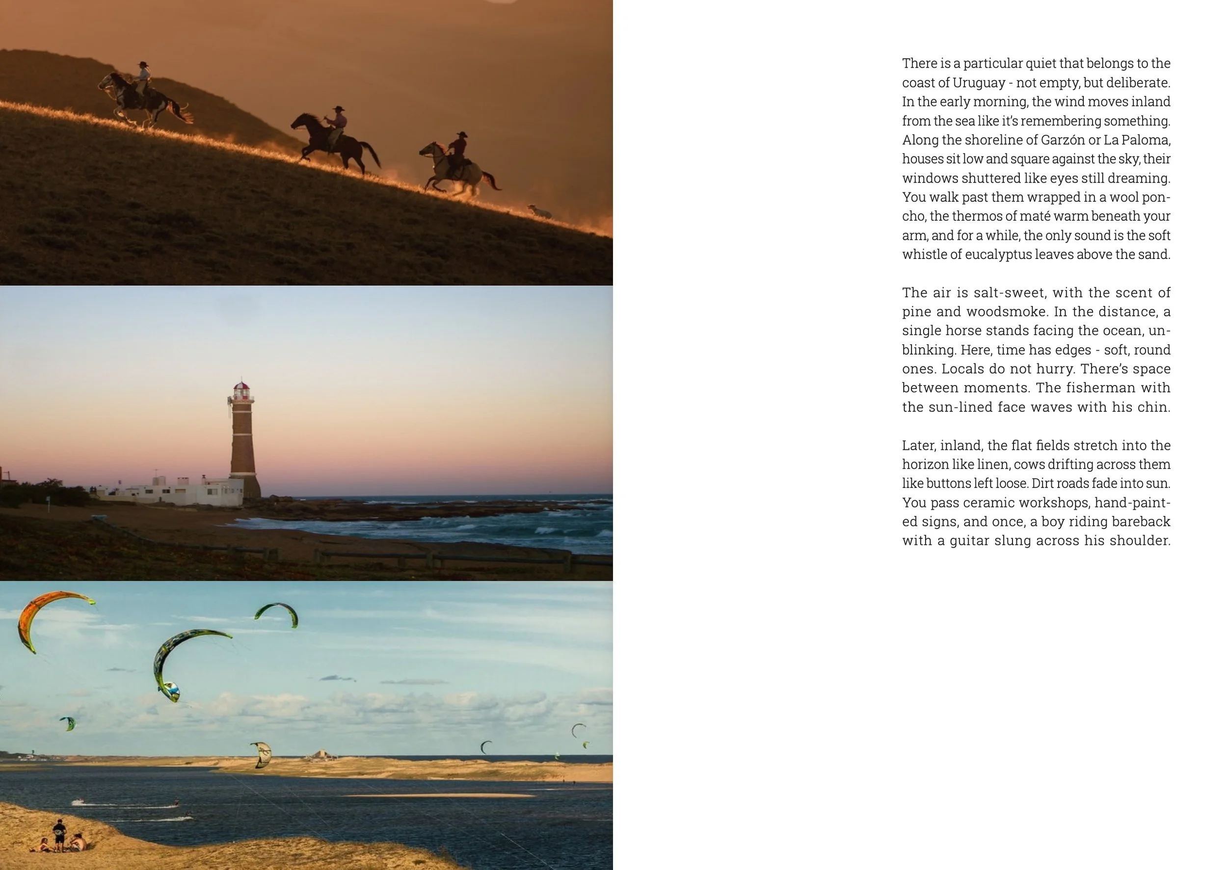
A visual editorial exploring culture, travel, and memory through minimalist design and storytelling. Rather than designing a magazine, the intention was to create something that felt like a personal archive… the kind of object you might find in someone's drawer years later.
Each spread was built around tone rather than template, using minimal layouts, film photography, handwritten elements, and negative space. Some pages began with an image, others with a sentence. Parts of the written content were drawn directly from my parents' travel journals, grounding the project in real, lived experience rather than constructed narrative.
The visual language sits at the intersection of modern and classic: considered composition, tactile detail, and room to breathe.
Song Interpretation: Sign of the Times
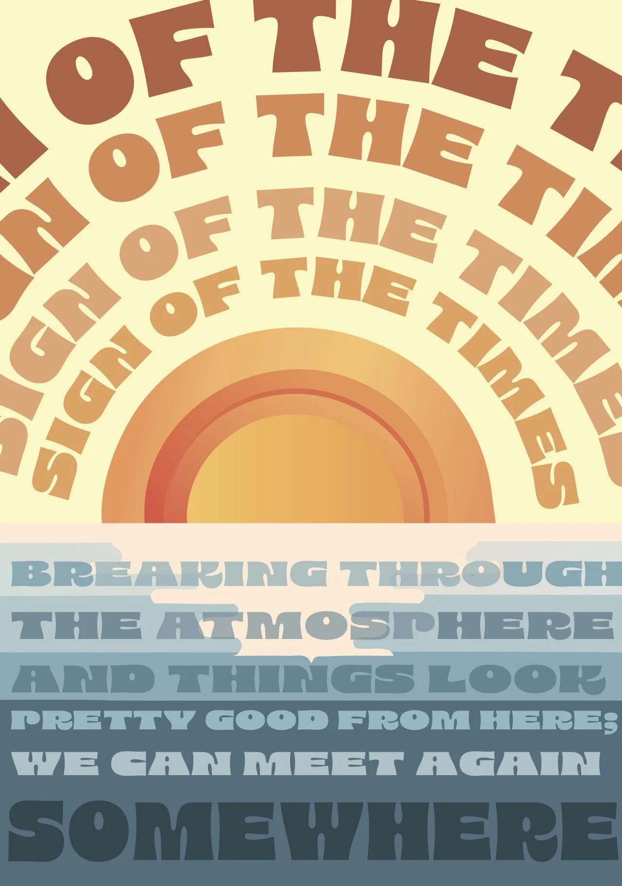
A typographic poster interpreting Harry Styles' "Sign of the Times," a song written from the perspective of a mother giving birth knowing she won't survive. The visual needed to hold both the beauty and the grief of that premise.
The design uses a split complementary colour scheme, warm oranges bleeding into cool blues, evoking a sunrise and a sunset simultaneously. The song title is arranged in a descending arc, each repetition of text getting progressively shorter to create visual rhythm and a sense of fading. The bottom half anchors in deep blue, with layered lyrics in chunky, retro-inspired typography drawn from 1970s design sensibility.
The sunset was a deliberate choice: something that is beautiful precisely because it is ending.